When Windows 10 was launched back in 2015, Microsoft stated that this would be the last major release with a distinct version number, as Windows would become more of a service receiving constant minor updates. Fast forward to 2021, and Microsoft has other plans for Windows and its ecosystem. Windows 11 was announced in June 2021, and now it’s time for the official release. Let’s see what Windows 11 brings to the table.
Getting Windows 11:
After the announcement of the launch of Windows 11, there was a lot of fuss about the devices that could support it. Windows 11 officially requires a Trusted Platform Module (TPM) 2.0, UEFI, and Secure Boot in order to run on a machine, and if yours doesn’t meet those requirements, you will not be able to install it. The easiest way to check whether your hardware is eligible is by installing Microsoft’s own PC Health Check application.
If you haven’t already received an alert prompting you to update, and your PC is compatible with Windows 11, you can use the Windows 11 Installation Assistant Tool to download and install the update onto your system. This will not erase any of your personal files and is similar to an OTA (over-the-air) update – however, it’s always advisable to have backups. Similarly, you can create a bootable USB drive or a disk image to perform a clean install.
Windows 11 will be a free upgrade for people coming from Windows 10. Retail pricing for people with custom-built PCs has not been revealed yet. The installation process has been given a simple and minimalist redesign, which I personally found quite pleasant. Microsoft’s official website showcases the system requirements for Windows 11: a 1GHz CPU or faster, 4GB of RAM, 64GB of free storage, a high definition (720p) display that is greater than 9 inches diagonally and supports 8 bits per colour channel, a GPU that is compatible with DirectX 12 or later with a WDDM 2.0 driver, and of course, the above-mentioned TPM 2.0 security chip, UEFI, and Secure Boot capability.
Windows 11: Design and interface
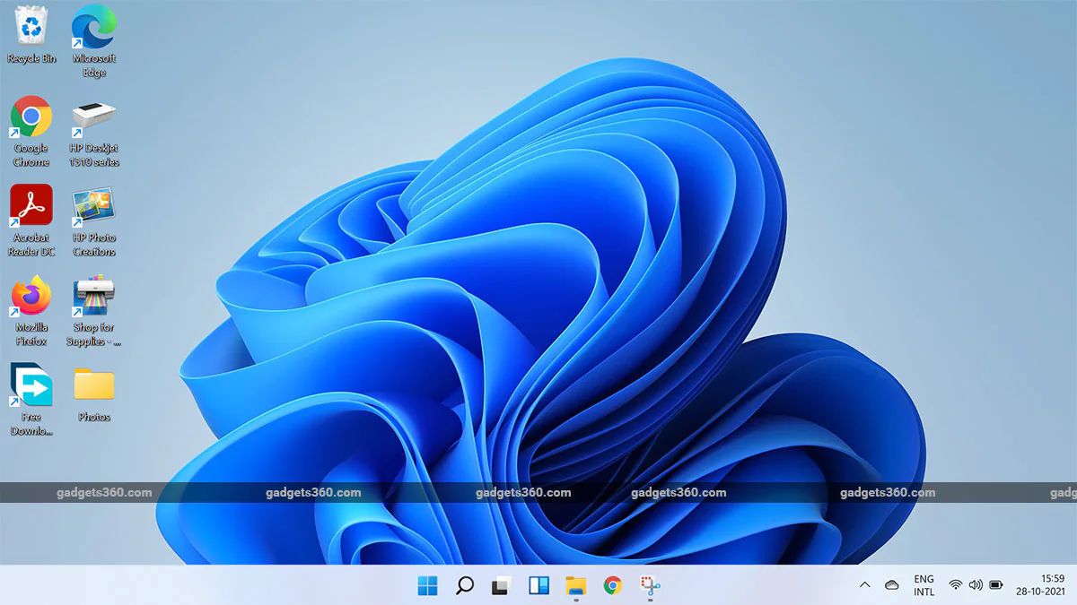
The Windows taskbar with a Start button in the bottom left corner is now familiar to millions of PC users. However, this time around, Microsoft has changed that. The company says “With Start, we’ve put you and your content at the centre.”
Yes, the Start button is now located roughly in the centre of the taskbar. It took me some time to get used to the fact that it is not in the lower-left corner of my screen anymore. My muscle memory almost always signalled me to move my cursor to the corner. Luckily, we have an option to move the Start button back to its traditional place.
The Start Menu has been redesigned to list all of your apps in a more systematic and organized manner, and you can of course pin apps that you use frequently. You can also see all your installed apps here. There’s a Recommended section, wherein you can find recently accessed files and folders. The Start Menu has been designed to be consistent with the frosted glass theme that you’ll see throughout Windows 11, and it looks good. Oh, and say adios to Live Tiles. These were the animated squares you could see whenever you opened the Start menu in Windows 10. They were implemented to show you live updates for apps such as Weather, Calendar, etc, but that functionality has been moved elsewhere – more on that later.
![]()
The taskbar is centred and some applications are pinned for easy access
If you right-click on the taskbar, you now see just one option that lets you enter the taskbar settings, instead of the plethora of options in previous versions of Windows. However, this means you cannot reposition the taskbar to either side or the top of your screen anymore with Windows 11, which is kind of a bummer. The Start button follows all the new design fundamentals of Windows 11 with rounded corners, colourful icons, pinned apps, and a huge search bar. The search button feels more useful and responsive compared to Windows 10’s version. If you hover over the icon, it will show you your most recent searches, which could save you some time.
You will also see Microsoft Teams integrated into the taskbar. I’m not entirely sure how pinning Teams here is beneficial to everyone, but it is something Microsoft wants you to try. During the pandemic, many people have turned to video calling on platforms such as Zoom, Google Meet and Teams, and that could be the reason that Windows now has Teams placed front and centre. If you prefer not to use Microsoft Teams, you can disable this from the taskbar settings.
Windows 11 brings some new themes and wallpapers that are attractive. The Personalisation settings panel is not much different compared to Windows 10 – every setting option is neatly organised here, and you can change the wallpaper and tweak the theme colours, lock screen, taskbar, font, and background to your liking.
Windows 11: Widgets
The taskbar now also gives you access to widgets, which I personally am not a big fan of. These basically show quick updates from apps and services, somewhat replacing Live Tiles. The News widget shows current events from across the world of politics, finance, sports, technology, etc. This was made available in recent versions of Windows 10 as well. However, it has a different appearance here and it also shows up from the left side of your screen instead of the bottom right.
![]()
Widgets appear in a panel on the left side of your screen
You can add various widgets, and there are 11 options from Microsoft to choose from at launch time. These include Outlook Calendar, Tips, Sports News and Scores, Photos, Entertainment, Traffic Updates, Family Safety, and interestingly enough, Esports as well.
Unfortunately, we cannot yet integrate third-party widgets into this panel, which makes it less useful. If you click or tap on any of these widgets, the linked content will open in Microsoft Edge, no matter what your default browser is.
Windows 11: Notifications Panel and Settings
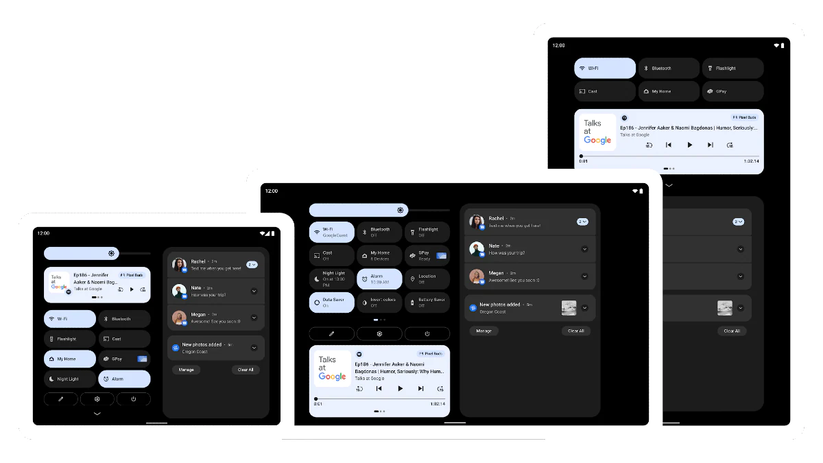
Another major design change you’ll see everywhere is rounded corners. These have been implemented across the UI, and I have to say, I quite like it. Microsoft is clearly taking some inspiration from Android and macOS with respect to design. This can also be seen in the Notification Centre which no longer has its own icon. It is now integrated into Time and Calendar. This looks really well done and fits perfectly into the vision of Windows 11.
The status icons next to the clock in the lower right corner of the desktop have now been grouped, and a single click will pull up a new Quick Settings panel. Many of the Quick Toggles that used to sit in the Notification Centre have also been incorporated here. This panel allows you to tweak audio settings, screen brightness on a laptop, and Wi-Fi as well as Bluetooth connections. Windows 11 lets you add additional controls such as Casting, Mobile Hotspot, Keyboard Layouts, etc.
![]()
Quick settings for Wi-Fi, Bluetooth, and other frequently used features are grouped in this panel
The Settings app has gone through a design overhaul too. Windows 10 made us switch between the Settings app and the age-old Control Panel for many advanced settings. You might still have to visit the Control Panel for some tasks, but we can see that with Windows 11, Microsoft is still trying to get rid of it. The Settings app now looks and feels more pleasant and user-friendly. It shows you all the categories with icons, somewhat similar to a smartphone experience, which might make things easier to find for many people
Windows11: File Explorer
File Explorer has been completely redesigned. The icons look smart, and the frosted glass look has been spread over the entire UI. It feels as though Windows is trying to look like macOS but also not look like macOS at the same time. One thing that bugs me is the fact that folder icons no longer show thumbnails of their contents, such as photos. The default Documents, Downloads, Videos, and Pictures folders are now vibrantly colour-coded, and these look cartoonish, but they are now more differentiated and quickly recognisable.
![]()
File Explorer gets a colourful overhaul
The Windows Explorer toolbar, which contained all the necessary tools and shortcut buttons, has also been redesigned completely and will show contextual options depending on what is selected. Right-clicking on any file or folder will open up a compact context menu with the traditional Cut, Copy, Paste and Rename options moved to the top
Windows 11: Snap Layouts and Snap Groups
This is probably what excites me the most about this upgrade. Microsoft is focusing on multitasking with the launch of Windows 11, and I am all for it. Snap is something that was first introduced with Windows 7, allowing users to quickly tile program windows side by side. Windows 10 improved that, adding more flexibility. This time around, Microsoft has introduced Snap Groups, which are exclusive to Windows 11.
Hovering over the Maximise button on a window or hitting Win + Z will now let you choose a Snap Layout. A menu shows you different grid templates that you can choose from, depending on your needs. Once you choose a template, Windows will show you the apps you have open in the background, so you can assign them slots.
![]()
Snap Layouts and Snap Groups make multi-tasking easier in Windows 11
Windows will now remember your Snap Groups and show them as a collection when you hover over an app’s taskbar icon, making it easier for you to multitask. If you minimise an app when in the Snap Group, you can now go back to the same layout by hovering over the taskbar icon of the app and selecting Snap Group. The best part is that even if you sometimes connect your laptop to an external monitor and create Snap Groups, Windows 11 will remember the correct arrangement the next time you’re plugged in. This is really efficient since you do not have to create another Group each time you connect to an external monitor.
Windows 11: Microsoft Store
The Microsoft store, just like everything else, has also received a fresh new look. The store categories have now been cut down to Apps, Movies, TV Shows and also Games. The main highlight of the Microsoft Store is the upcoming support for native Android apps, with the help of Amazon’s Appstore.
![]()
Microsoft Store also gets a brand new look
Microsoft showed us a quick preview of this at the Windows 11 launch event by opening the TikTok app on a Windows 11 PC. There’s no fixed date for when this functionality will be ready for use, but it will come with a future update. The apps currently available in the store are Progressive Web Apps as well as Legacy Win32 and UWP apps.
Windows 11: For gamers
There is no way Microsoft will forget gamers. Windows 11 benefits from some new gaming-centric features, including Auto HDR, DirectStorage, and a more integrated Xbox app.
What does Auto HDR mean and what will it do to improve your gaming experience? In simple terms, HDR (High Dynamic Range) refers to the ability to reproduce a wide spectrum of light between the darkest part of the display and the brightest. This can change the entire look and feel of a game with richer colours and higher contrast. Auto HDR is a new feature that allows games that weren’t designed from HDR to still benefit from it. You’ll need a monitor or a laptop display that supports High Dynamic Range, and games that run on DirectX 11 or higher.
As for DirectStorage, it helps games to load faster by eliminating bottlenecks between your PC’s storage and graphics hardware. This requires at least a PCIe 3.0 NVMe SSD with 1TB of space, and a GPU that supports DirectX 12. A PCIe 4.0 SSD is recommended for optimal performance. This is the same technology used in the recently launched Xbox Series S and Xbox Series X. Both DirectStorage and AutoHDR will be supported on Windows 10 as well, though.
Last but not least, the Xbox Game Pass for PC and Xbox apps have been combined so you no longer need to juggle between them. A membership enables access to 100+ high-quality PC games from Microsoft and Bethesda on launch day. Additionally, you can get an EA Play Membership with Game Pass for PC or Ultimate.
Windows 11 Verdict: Does it make sense to upgrade?
Microsoft has limited the number of devices that can officially run the latest version of Windows, with its restrictive hardware requirements. Most of the latest laptops will support Windows 11, but you’re probably out of luck if you built your own desktop PC or use anything more than around four years old. With that said, if your device supports Windows 11, there is no reason you should not upgrade.
It is by no means a colossal improvement over Windows 10 when it comes to functionality, but it does give you a fresh new look and feel. Microsoft has focused more on the user experience, and implemented a few minor changes here and there. Thanks to the improved Snap Assist and Snap Groups, it is now much easier to multitask on Windows.
However, Microsoft is yet to actually roll out some of the major features that were highlighted at the launch event, which include support for native Android apps via the Amazon Appstore. Microsoft has also removed basic functions such as the ability to drag and drop files into applications pinned to the taskbar. Some remnants of Windows 10 and even older versions can still be seen too.
Overall, if you are used to Windows 10, this new upgrade should not hinder your experience with anything unfamiliar or unexpected. As I said, the update is more about design than function. If you are sceptical about Windows 11, I’d suggest waiting, since you wouldn’t lose out on much.
Once you’ve installed Windows 11 and wish to roll back to Windows 10, you can do so by going into the Start menu > Settings > Windows Update > Advanced options > Recovery and then hitting the ‘Go Back’ option. Keep in mind, this will only be possible for 10 days after the upgrade since Windows will delete all the rollback files to save space after that.
Pros:
- Fresh and attractive UI
- Snap Layouts and Snap Groups are very handy
Cons:
- No support for native Android apps yet
- Some familiar shortcuts and customisation options don’t work anymore
- Requires modern hardware
[ad_2]
Source link


