
Customers don’t want to dig for information.
Trying to locate the information you need on a poorly structured website can be as frustrating as wandering around a beach looking for treasure with no map.
Your websites might be your future customers’ first impression of your brand. Don’t you want to delight your customers with an enjoyable experience?
Structure your web content in a way that enables users to find the information they need quickly. If it isn’t, it can be detrimental to your bottom line.
Most consumers are unlikely to return to a website after a bad experience.
You can start by examining your information architecture.
Information architecture is the “organization, structure, and labeling of content in an effective and sustainable way.”
In this post, we’re going to examine the importance of your website’s information architecture and outline how to optimize it, so your website drives more sales for your business.
Three Components of Information Architecture
The three components that affect a website’s information architecture are:
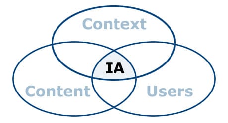
Before we outline strategies for improving your site’s information architecture, we must examine how these three factors impact it.
1. Users
When setting up your website, you have to put yourself in your customer’s shoes. Think about the people who are browsing your website for the first time.
What should they get from it?
Set up your website in a way that ushers these users to a centralized, focused call-to-action. You need to funnel these users to a specific CTA that will get them to convert.
But how can you know exactly what your consumers want?
You need to get inside their mind or ask them directly. There are two ways to accomplish this: persona building or focus groups.
Personas
Draft personas for the different types of customers you are targeting before you map your site. These can help you mold the site to fit their expectations and habits.
When drafting a persona, ask yourself these questions:
- How do your customers spend their time?
- Where do your customers visit most often?
- What problems are your customers trying to solve?
- How does your customer’s typical day look?
If you can get more specific, you make the persona more useful. Businesses that used personas made their website2-5 times more effective than those that did not.
Personas are great for companies with no customers or thousands of customers. They can help guide you in your website decisions when creating or evolving your site architecture.
Focus Groups
If you already have customers, simply ask them to test out your site. Focus groups are an excellent way to understand how consumers navigate and interpret your site.
By observing a group of people who have never visited your site try to understand your offering, you can see what content is missing and adjust your information architecture accordingly.
2. Content
It isn’t enough to just think about your users and who they are. You need to focus on crafting the content they are looking for and hosting it on your site.
To evaluate your current content, you need to take inventory.
Take stock of everything you have available about the company, including landing pages, product descriptions, articles, case studies, mission statements, bios, the brand story, and more.
Look at the scope of your content and evaluate:
- How does this content fill the needs of my target audience?
- What content am I missing that my target audience would value?
- What content can I delete? What content should stay on my website?
- Is there any hidden content that I need to surface better?
After you have the content you want to add or keep on your site, you need to map out how it will fit together.
3. Context
Context involves how your content appears on your site, what supplemental content it is beside, and how it is linked or mapped throughout your site’s information architecture.
It also shapes the way users interpret information on your site.
Studies show that “context shapes users attempt to construct meaning as they read,” meaning that as users interpret content, they comprehend and digest it based on the way and environment it is presented.
That’s why how you structure and map your content throughout your site is so important.
Even software platforms understand the significance context plays in website architecture.
Web platforms make it easy to make edits or changes to pages within a particular context. For example, Magento created its own “content hierarchy” between your website, store, and store views. Magento labels these as “scopes,” allowing you to apply settings and changes contextually between each separate hierarchy.
Now that we understand the main influencing factors of information architecture, we can examine the strategies used to improve the content structure of a site.
Improving Your Site’s Information Architecture
There are four key strategies to keep in mind while building and improving your site’s information architecture:
- Use goals at guideposts
- Start with a mobile-first view
- Go from broad to specific content
- Delete poor-performing content
Those strategies will help organize your content in a way that is easy to comprehend and straightforward for your customers. Let’s look at each one in-depth.
1. Use Goals as Guideposts
For every piece of content, you need to ask yourself, “Is this accomplishing your site’s goals?”
Clearly articulate your business goals on the site, with each page contributing to achieving those goals.
Some common site goals include:
- Increasing qualified leads
- Increasing conversion
- Generating more awareness
- Increasing organic traffic
- Driving more sales
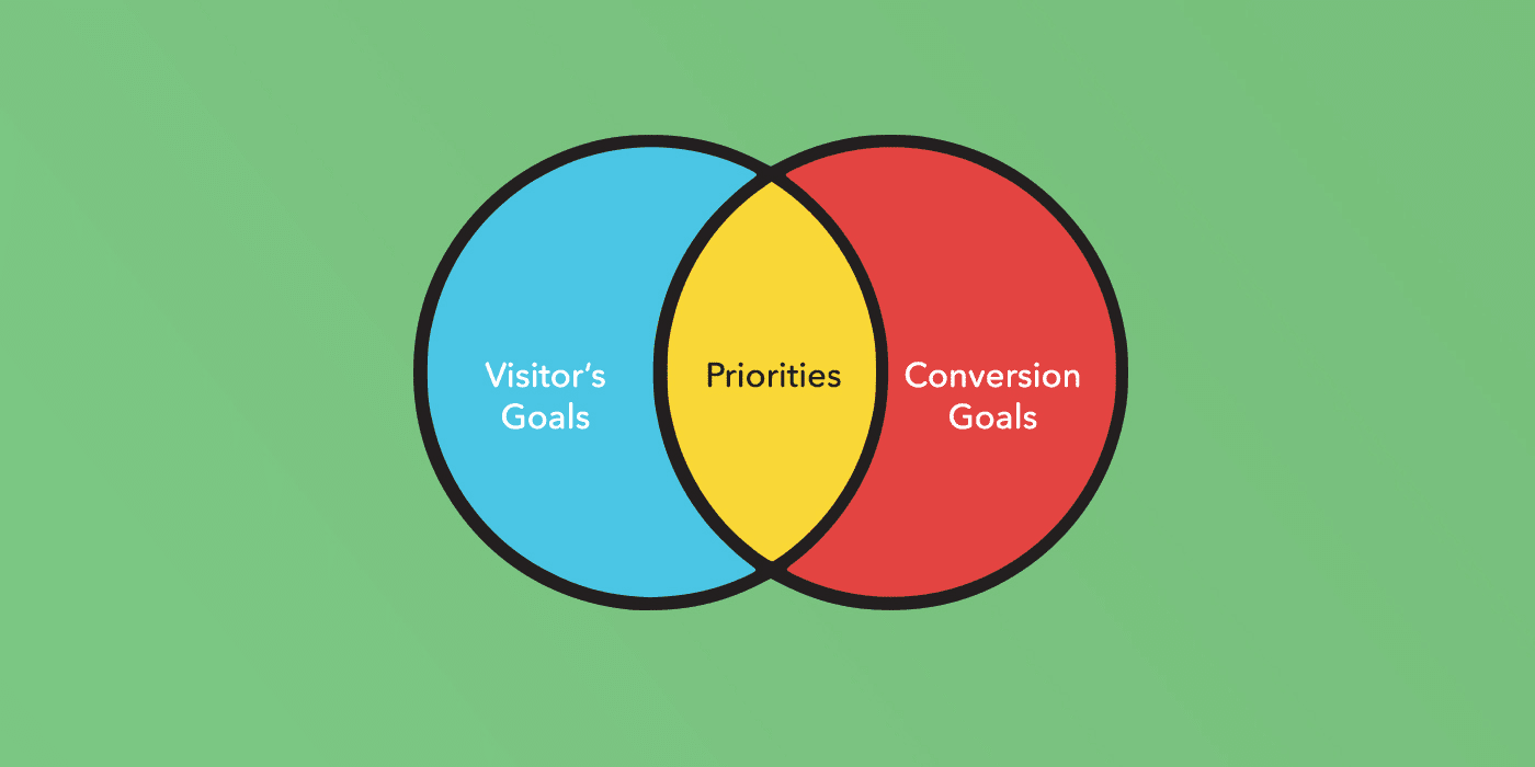
When weighing your website goals, consider how your visitor’s objectives and conversion goals overlap to help you understand what you need to focus on.
Consumers want to be able to click on a page and understand immediately what the business is about. If they can’t figure it out in ten seconds, they will leave and go to another site.
If pages don’t reinforce the company’s overarching goals and messaging, they need to be reworked and rewritten in a way that does.
2. Start with a Mobile-first View
Evaluate your site’s information architecture through the lens of your mobile device. Where do you look first? What content is in focus? What is missing?
Due to the smaller screen and responsive design, your messaging and content can be shifted or shortened and not capture the true essence of your business or site’s goals.
This is important because over 52.03% of web traffic in 2020 comes from a mobile device, which is the highest amount over the past ten years.

The small-screen mobile view will also help you simplify your content.
This will be a valuable exercise for your business because many consumers admit that they are overwhelmed with choice when visiting websites with too many options to select.
By seeing what information is in focus on mobile, you can begin to create a hierarchy and prioritize the critical messaging points you wish to convey.
3. Go from Broad to Specific Content
When adding content to your site, it’s good to start broad and then get more specific, as it will help build content in layers on top of each other, allowing the user to start with a general overview of the business and get more detailed.
The pages can have internal links that go to more specific pages, which facilitates the user’s learning process and allows them to control how in-depth they want to go.
Here is an example of how a health insurance site would structure its content:
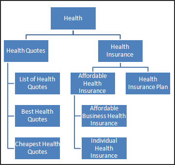
As you can see, the topics get more specific as the user gets deeper into the site.
The broad topic of “health” welcomes the users, while a page about “individual health insurance” would have specific content for a singular topic or issue.
4. Delete Poor-Performing Content
If the content isn’t performing well, it has to go.
Poorly written content, thin content, or duplicate content can all negatively impact your SEO rankings, making it more difficult for users to find your site.
Reporting software like Google Analytics can give you a page-by-page breakdown of how your content is performing.
If you aren’t getting a lot of traffic or have a high bounce rate, you should consider how you can retool the content to make it better or simply take it down.
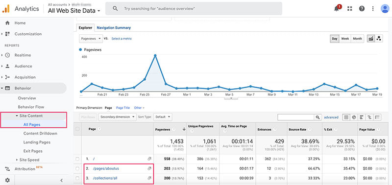
One way to audit your content beyond site metrics like unique visitors, time spent on the page, bounce rate, and conversions is to complete a content mapping exercise.
Content mapping evaluates the lifecycle and thought-process of your personas and assigns a specific piece of content to help during each stage of the buying process.
Awareness, consideration, and decision are three common decision-making stages involved in content mapping.
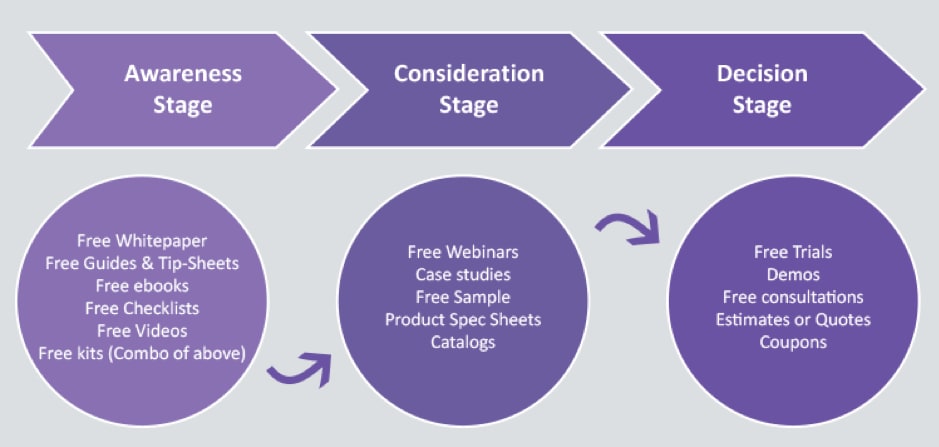
Awareness
Content consumed by potential customers in the awareness stage is positioned as discovery content in the forms of whitepapers, ebooks, blogs, and videos.
Awareness content highlights a high-level overview of the problem, term, or industry.
It’s appealing to a customer that wants to grow their business and might want to learn how to better retain their customers.
Consideration
Content in the consideration stage introduces the product as a solution to the user’s problem.
Consideration content provides prescriptive how-to examples for leveraging the product in different scenarios and business units.
The pages of websites that are most commonly content that is intended for the consideration phase are the product pages, how-to articles, webinars, and spec sheets.
Decision
Decision web content includes various web resources designed and positioned to help the customer understand how the product can help their business.
It includes demo pages, case studies, consultations, and more.
Websites Need Well Thought-Out Information Architecture
Businesses need to structure information on their website in an easy-to-comprehend way. If not, users will leave the site and go to competing companies.
When establishing or improving a site’s information architecture, businesses need to consider their users, content, and context.
There are many strategies to improve a site’s structure over time in hopes of providing a more enjoyable user experience.
Always frame content and website decisions with their overarching business goals as guideposts.
Consider how mobile devices display content. Use the small screen to your advantage and simplify your messaging.
Go from broad to specific content on your site. Build layers of content on each other, so pages become indexed, and there is a natural flow for the consumer.
Delete poor-performing content that isn’t doing anything for your customers and is hurting your SEO.
[ad_2]
Source link


