What is a Call to Action?
A call to action, normally articulated as a CTA, is an encouragement to act in a specific way, often accompanied by confidence builders and/or a sense of urgency.
Today, these CTAs are found in buttons and links that exist in the middle of your web page copy, in your sidebar, and at the beginning or end of your blog posts.
How do you write a good CTA?
The three parts of a well-crafted Call to Action are:
- Encouraged Action
- Confidence Booster / Destination
- Time Sensitive Clause
Of course sometimes these aren’t all explicitly articulated. A button may be the encouraged action, without needing to say, “click here.”
The same is true for time-sensitivity. It might state “get started” when it’s suggesting (without saying,) “now.”
Other times, when the CTAs are links, you might see the full articulation:
- “Click this button to start converting visitors into leads in no time”
- “Create your next landing page in minutes instead of hours or days”
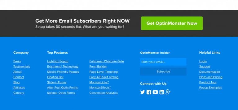
Check out this example by the folks at OptinMonster. There’s a strong benefit statement with an additional sense of urgency. It only takes 60 seconds to get results? Do it!
One way to cause a sense of urgency is to highlight a fear of missing out (FOMO).
“…that fear of missing out taps into several human emotions (some of which we’d rather not admit to). It’s more than just fear because that fear is based in something else:
- Panic: ‘If I miss out, I’ll never know if this could have changed my life!’
- Greed: ‘I have to have everything.’
- Comparison: ‘I don’t want to be the only person without this!’
- Curiosity: ‘Could this possibly be as amazing as they describe?’
- Pride: ‘I got in and you didn’t. Ha ha.’”
Are there phrases that work best for CTAs?
Absolutely. SproutSocial wrote a great article on CTAs that go into the phrases that work best.
The result of their research included these words:
- You
- Guarantee
- Results
- Free
- Because
- New
It’s not hard to recognize those words – because those are all the ones we know that trigger our own responses, right?
In fact, if you guarantee someone that a free new download will deliver the results they’re looking for, you’ll get the clicks you’re looking for because that’s what works.
Wait, I was supposed to link that whole sentence, right?
Two tips as you get started with CTAs
The first tip is that the end of every post you write should have a call to action on it. But make it contextual.
Most people make the mistake of making it generic.
Today I reviewed a site that talked about one topic and the call to action at the bottom was a suggestion to reach the author for a completely different (and not-related) reason.
Then, below the post was an ad that suggested you should hire the person for a third reason (completely unrelated to either of the initial two reasons).
We’ve all made this mistake but now is a good time to stop doing it. If you write a post about eCommerce, don’t end with a call to action that invites the reader to hire you for public speaking, with a large ad below the article suggesting people should buy a sweater.
Get the flow right:
- Have one topic for your post
- Create a Call to Action that is a logical conclusion for that topic
- If you have other ads on the page, only show ones that line up
As an example, at the end of this post, I could offer the following as potential CTAs:
- Sign up for next week’s webinar on capturing leads while there are still seats
- Download my eBook on lead generation software tools to automate your marketing
- Schedule a 15-minute call between your CMO and me to grow your revenue
Here’s another example from the OptinMonster folks.
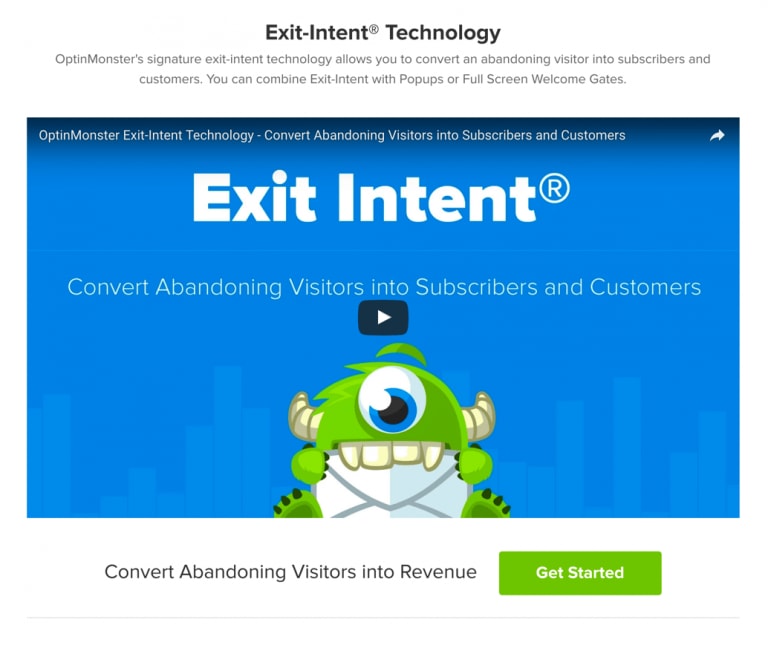
When you get to the bottom of the post, you see, “Convert abandoning visitors into revenue” and the button says, “Get Started.” It’s a perfect contextual call to action based on the fact that the page is about exit intent (i.e. people abandoning the page).
The second tip is to leverage technology to help you.
My favorite, as you can imagine, is OptinMonster. It brings a lot of features to the table to help you – from MonsterLinks that users click and see forms pop up, to conditionally displaying forms, to forms that appear as you get ready to leave a site.
That last feature is called Exit Intent and it is a great way to capture folks that landed on your page but aren’t planning to stick around. It gives you a great way to conditionally and dynamically create a perfect offer based on where they are on your site.
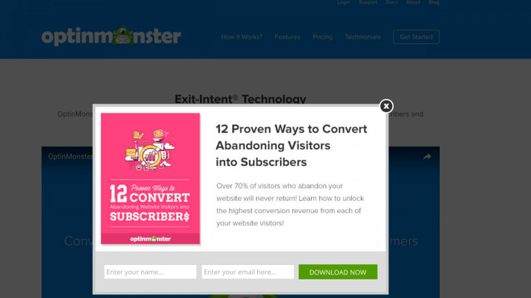
The “download now” button is the perfect CTA for immediate benefit on a topic that is clearly dear to their heart.
Consider this:
- The user visited OptinMonster to begin with – clearly an intention to review this kind of software.
- The user visited the Exit Intent page, which suggests this feature could be important.
- And then, as the user gets ready to leave, they’re offered a helpful document that will show them 12 ways to convert abandoning visitors. That’s the perfect offer.
It’s only made more compelling by the fact that the person who wants this kind of information is getting it because they’re about to do the thing that they want to stop others from doing (abandoning the page).
Wrapping up
As I wrap up this post on CTAs, here are the four rules I remind everyone about, when it comes to your calls to action.
Don’t frustrate your audience by putting tons of pop-ups on your page before they have even had a chance to read your content.
Don’t confuse your audience by putting the same offer on every single page, especially when there’s poor alignment between the offers.
Don’t bore your audience with an offer that is too pushy or too boring.
Don’t ignore your audience by ending an article on your site without an action they can take.
Have you seen OptinMonster? Think we should add it our Managed WordPress hosting plans as part of our platform? Tell me on twitter.
[ad_2]
Source link

