Sony Xperia Z Ultra detailed review
Some refer to big screen smartphones as “phablets”, but in essence, they are smartphones. In the case of the Xperia Z Ultra, the clarity of the definition of a phablet becomes even more critical, as we embark on the review of what is probably the most powerful Android smartphone and the largest phone available in India, at the moment.
Build & Design: The bigger Xperia Z
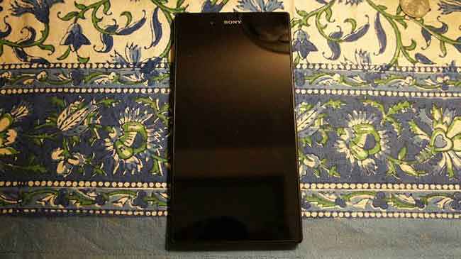
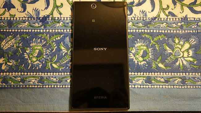
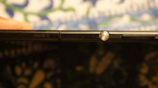
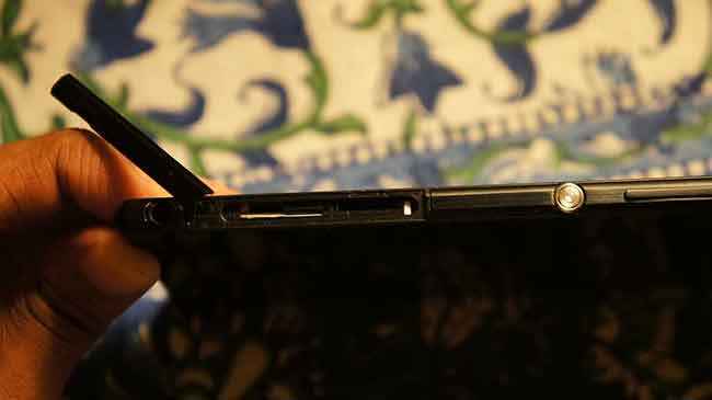
Undoubtedly, the Xperia Z Ultra borrows many design elements from the Xperia Z smartphone (read our review). The metallic frame with the tempered glass, both front and back, reminds us of the previous flagship. Other similarities include the circular aluminum power key on the right side spine, and the way the ports on the spines have been covered, and the integration of the Return, Home and Tasks keys within the onscreen UI. Essentially, the same design has been taken, and stretched on all sides, and we end up with a much bigger smartphone. There is no doubting the difference between the two though, when kept side by side. It seems as if Sony is trying to follow Samsung’s method of keeping a similar design tone across the range of smartphones, and the Xperia Z the Xperia Z Ultra may just be the starting point of this philosophy.
 |
 |
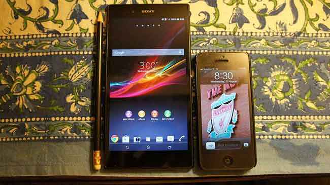
While the width and the height have grown from the Xperia Z, just 6.5mm on the thickness scale is something that you have to see to believe on the Xperia Z Ultra. Sony calls this the “world’s slimmest Full HD smartphone”. However, at 212 grams, it isn’t the lightest phone around, and that shows. While you can hold this with one hand, prolonged periods of this activity will lead to wrist fatigue. Secondly, with the 6.4-inch screen size, you really cannot expect single hand operation of the Xperia Z Ultra, and it will stick out of most trouser pockets that aren’t deep enough. This despite the fact that the bezel on the right and left of the screen is very thin, but at the same time, we believe the frame above and below the screen could have been thinner as well.
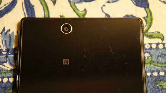
While the glass at the back of the Xperia Z Ultra looks very good, it will get scratched very quickly if you aren’t careful. Plus, it tends to catch quite a few fingerprints. While both will not be very visible on the white version, the black colour version does tend to show up the scratches and smudges very quickly, even though it is claimed that the glass scratch resistant. Another drawback of the glass back is that the surface becomes too smooth to grip, and in this case, the slightly raised metal edges come to the rescue.
 |
 |
The Xperia Z Ultra has the IP55/IP58 water resistance ratings, meaning it can be kept under 1.5 metres (5 feet) of water for up to 30 minutes. Even the 3.5mm headphone jack, which is not covered by any flap, is water resistant. This is an upgrade over the IP55 rating of the Xperia Z, which could stay in 3 feet of water for up to 30 minutes. Apart from that, the dust resistance rating remains the same for both devices. One good thing about this whole dust and waterproof thing is that all ports are nicely covered and that gives the design a rather smooth look, with the spines not looking overwhelmed.
Does the size work?
The question with a phone as big as this is – does it work for you? The answer isn’t really that simple. The Xperia Z Ultra sits in the betwixt between the big-screen smartphones and the 7-inch tablets. Irrespective of how big your hands are, it will be a stretch (no pun intended) to hold this phone. We do find this phone to be a little top heavy, and it tends to have the urge to fall on its head if you aren’t holding it tightly, assuming you are holding it like a chocolate bar. The Z Ultra’s thin frame and flat sides help your fingers wrap around the frame, but only just. Having said that, the two-hand operation requirement does bring it closer to a 7-inch tablet’s usage pattern. But, all is not bad with a 6.4-inch screen sized smartphone. The screen takes advantage of the 16:9 aspect ratio, and watching videos on this will be a rather pleasant experience. The on-screen keyboard, in portrait mode, is brilliantly comfortable. Web browsing is a very comfortable exercise as well. This phone is really only meant for someone who is desperate to find the best of both worlds – the smartphone and the tablet – in one device only.
 |
 |
Display: The real highlight
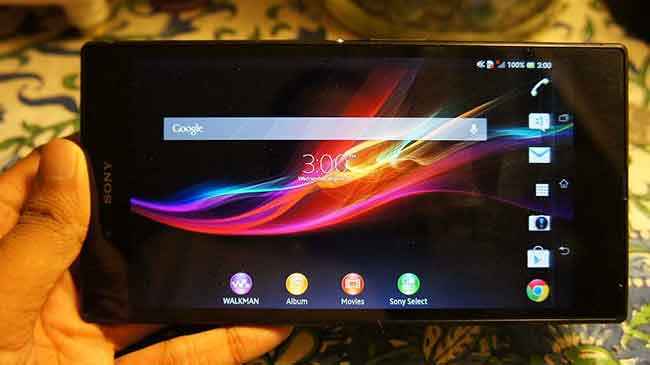
The 6.4-inch display is what Sony refers to as “world’s largest Full HD smartphone display”, and it’s not just that. Since the technology went into cold storage sometime in 2009, Triluminos is back. And this time around, Sony are going the whole hog with it – the new Bravia LED TVs, the Vaio Pro 13 notebook and also the Xperia Z Ultra smartphone. According to Sony, the use of the Blue LED as the backlight in tandem with the quantum dots will increase the range of the colours on the display by as much as 50%, in comparison with the conventional backlighting. The nanoscale particles, also known as quantum dots, emit very specific wavelengths of light, and changing their size can tune the colours they emit.
|
|
Resolution and screen size aside, the 6.4-inch display has a pixel density of just 344 ppi, which does look fairly inferior to the 441 ppi found on the Xperia Z and 469 ppi that the 4.7-inch display on the HTC One boasts of. While those are numbers for the pedantic ones, the real world comparison between this display and an AMOLED display gives out its clear verdict – the colours on the Xperia Z Ultra’s display are less saturated and more realistic. For example, AMOLED displays always have overbearing reds, which isn’t the case with the Triluminos panel on the Ultra. Another feature that we have already seen on Bravia TVs is the X-Reality picture engine. The Opti-Contrast, much like the ClearBlack on Nokia smartphones, takes care of deepening the black colour levels as much as possible, making all other colours look better as well.
 |
 |
Numbers and tech aside, the Z Ultra’s display is impressive in the real world. Brightness levels are impressive, and even at 60% brightness, it is more than easily usable in sunlight. The glass over the screen does mean there will be reflections that’ll bother, if the brightness is set below 40%. Anyone looking to peek in from the side and see what is on your phone’s screen will be in for disappointment – the silver lining!
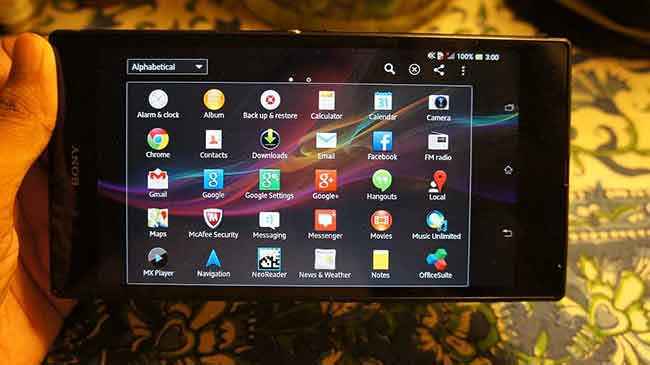
Secondly, with the display scaling as it is, text readability on web pages might be an issue because of the small font sizes, unless you specifically zoom in on the text. This is something that is also somewhat applicable for the text that accompanies the app icons, because a lot more icons now fit in one screen, but the font size compared to the smaller screen Xperia Z hasn’t gone up. This could be a tad annoying for anyone who hoped that the bigger screen would mean better readability.
Stylus: Every pen is your stylus!
Unlike the Note series of big screen smartphones which comes equipped with their own stylus, the Z Ultra doesn’t. This does bring up an interesting question – can I use a stylus with the phone? The answer is yes – any pencil or ball point pen will work as the stylus. While Sony has been fairly tightlipped about the technology it is using, there are two important aspects that make this possible – the touch panel is placed on the same layer as the LCD, which negates the need for any sensors to detect stylus input. And secondly, to enable the use of a variety of writing instruments as a stylus, the screen has been coated with the super hard coat ASF to prevent scratches from the inevitably heavy input from makeshift styluses.
 |
 |
We used a ball point pen, and the response was absolutely consistent and surprisingly smooth. Use the handwriting method to type out an SMS, and bad handwriting inconsistencies aside, the input was detected without fail. This is a rather neat feature that negates the need of a stylus that you need to ensure doesn’t get misplaced, and just any ball-point pen or plain-Jane pencil do the same task.
Performance: Life moves fast. This phone moves faster!
The Xperia Z Ultra is the biggest smartphone we have ever reviewed, and easily the most powerful as well. This is the first phone with the 28nm Qualcomm Snapdragon 800 quad-core (Krait 400 cores, which offer higher clock speeds than Krait 300) processor clocking at 2.2GHz, and is paired with 2GB of RAM. And this is the first phone that we are testing with the Adreno 330 graphics.
 |
 |
It is not a surprise that the performance of the Xperia Z Ultra is blazing fast. The benchmark tests peg this processor as the fastest among all, and is as expected, much faster than the Snapdragon 600 on the HTC One and the Exynos octa-core processor that the Galaxy S4 struts around with. To give you an idea of how the system benchmarks compare, you can check out the graphs here. In all system benchmark tests, the Snapdragon 800’s superiority is very much clear. But, as was the case with the Exynos 5 and even the Snapdragon 600, you will not feel there is that extra headroom in most daily tasks on the phone – the usual social networking apps, video playback, music, etc,. It is only when you are gaming that will you notice the lesser load times.
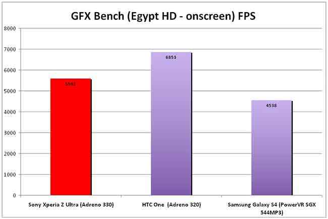
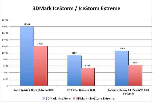
In terms of gaming, the Adreno 330 is a beast in its own league. Qualcomm claims that the 330 is 50% better than the 320. In the two 3DMark tests, it is trouncing the Adreno 320 and the PowerVR SGX544MP3 by a comfortable margin. And Qualcomm’s claim stands true, so far. Which makes the score on the GFX Bench a bigger surprise, where it falls behind the Adreno 320.
 |
 |
To be brutally honest, most of the times, you will not really notice any performance difference between Real Racing 3 on the HTC One, and Real Racing 3 on the Xperia Z Ultra. It is only the big display that will enhance the experience for most users, and only the real hardcore gamers will be able to actually utilize the Snapdragon 800’s advantage over the Snapdragon 600.
.jpg)
There is no doubting the reality that the Xperia Z Ultra is the fastest smartphone available in India, at the moment, by far. But, it is a pity that a wide demographic of potential users will not be able to enjoy the extremely powerful hardware, because of the form factor.
Waterproof: We tested, and it survived!
There are often big claims about a phone’s water resistance capabilities. We are, not for one moment doubting what Sony is saying about the IP ratings for this phone. But, just to give you a visual experience of the claims, we dipped the Xperia Z Ultra in water for around 3 minutes, with a video playing back on it. And the phone emerged from its bath, alive and kicking. The only little thing that you will have to do is wipe the display, otherwise it tends to behave rather erratically. Also, the pressure from the water is sometimes registered as a touch input, as you can see when the video skipped in the timeline as the phone was being transferred under water. We have been using the phone since then, and it is performing as if nothing has happened. Just to be on the safe side, always double check if the memory card slot, SIM slot and the charging port – all have the water proof covers properly bolted on.
Camera: A case of two halves
While you would imagine that the latest flagship would have the newer camera technology seen in the Xperia Z, the Z Ultra still rocks the older-gen 8MP Exmor R sensor, and there is no flash. Clearly, Sony does not want this to be the ultimate camera phone in the lineup, and neither does it want to lag behind too far, at least on the specs.
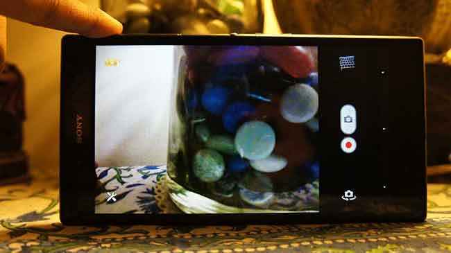
The snapper interface is pretty similar to what we have seen on the recent Xperia phones, and for the upgrading demographic, the familiarity aspect remains. The icon sitting on the top left of the camera UI opens up the various shooting modes, including Superior Auto which is meant for anyone who doesn’t want to fiddle with the settings, or have the moment pass while doing so. In Superior Auto, most settings are not available, but in the other modes, you get ISO, Focus mode, exposure, white balance, stabilization and HDR settings.
The 8MP mode clicks pics with a 3264 x 2448 pixel resolution, but with HDR active, this gets bumped down to 7MP with the 3104 x 2328 pixel resolution.
Why we call this a case of two halves is because the camera is quite acceptable when the lighting is good, but just disappoints when the darkness falls. If you look at the shot of the flower and the leaf with the water droplets, the detailing, crispness and colour richness is very good. The same detailing is what you will notice in the scenery shot of the road outside, cars parked both sides.
But, do not expect the same amount of clarity and richness when taking shots indoors or in low light. The close up of the MacBook keyboard throws up distinct noise around each white alphabet on the keys. Noise ruins the shot of the Formula 1 car sitting inside the glass case. If you want to take a shot of a moving subject in low light, all you will end up with is a blurred image, irrespective of the mode you are using. Switch between the modes to see which one offers the best shot at that time, because there is no consistency in terms of quality across.
Battery Life: Surprisingly good
For a big screen phone that packs in a 3050mAh battery, you shouldn’t assume too many big gains because of the massive 6.4-inch display it is powering, over and above the extremely powerful hardware. However, the test results that we got are rather impressive.
In the video loop test, we played back an HD video for 20 minutes on loop with volume at full, after completely topping up the battery. At 50% brightness level, the battery remained at 100% charge. The same thing was repeated 100% brightness, after the battery was fully charged again, and the battery life dropped down to 98% after 20 minutes. In the same tests, the HTC one drops down to 97% charge on 50% brightness and 93% charge at 100% brightness.
As a primary phone, the Z Ultra lasted from full charge at 8am on one day to about mid-day the next day. The usage included two email accounts, couple of hours of voice calls combined during the day, a bit of camera usage, YouTube videos and IM chats. During this entire time, the screen was set at auto-brightness. We would consider this result fairly impressive, considering the power this phone packs inside.
Buy or not buy: Just too big for most people
It is a pity that a phone as powerful as this is easily alienating people, simply because of its sheer size. If this was a more conventional ~5-inch screen-sized phone, it wouldn’t have taken much to convince us of the superiority over the likes of the HTC One or the Samsung Galaxy S4. But, not in this case, simply because not everyone would appreciate carrying the massive Z Ultra around. Yes, there will be the takers for something that is called a smartphone but is almost a tablet, but those numbers won’t be too large.
[ad_2]
Source link


