
Everyone wants their eCommerce site to convert better. A lot of work goes into an eCommerce site, and boosting the conversion rate can mean more profit from that initial effort. But to really maximize those efficiencies, you have to design your eCommerce site for conversions.
Chris Lema, the vice president of products and innovation at Liquid Web, offered his thoughts on eCommerce conversions in his free webinar. Watch the full webinar for all of Chris’ insights, but we’re going to summarize what he shared.
eCommerce Is Hard
But first, can we be honest about something? eCommerce is hard.
- A site has to have good code to even function properly.
- A site needs to be well designed to be usable and appeal to visitors.
- A site needs good copy to answer questions and move visitors through to checkout.
- A site also needs to know psychology—selling involves understanding what people want and why and addressing the various roadblocks that come up.
There’s a lot you have to get right, and it’s not easy.
eCommerce is also a work in progress. You’ll always be tweaking and improving and adjusting and trying new things and giving up on other things.
It’s a moving target. So before we get into the ways you can design your eCommerce site for conversions, let’s just recognize how hard this is.
And you can blame Amazon.
Today’s customers have their expectations set by Amazon, and that’s a high bar to compete with.
Now let’s start with the five areas where you can focus your efforts and boost your conversions.
1. Need for Speed
The single biggest reason stores don’t convert is speed. If your site takes too long to load, customers leave. You can’t convince someone to make a purchase on a site they’ve already left.
According to a 2017 Akamai study:
- A two-second delay results in a 51% decrease in session length. So as customers are browsing your store and moving between pages, if there’s a two-second delay, you just lost half your potential sales.
- Even a delay of a tenth of a second can lower conversions by 7%.
- Best conversions happen with load times under 2.7 seconds. Google actually uses this benchmark to decide if your site is user-friendly. Over 2.7 seconds? Your store is unfriendly.
- Stores with load times under 1.2 seconds see a big drop in bounce rate. People stick around if the site loads quickly.
So speed has a major impact on conversions. And most sites are not speedy.
Radware studied the top 100 eCommerce stores in 2015:
- The median page took 5.5 seconds before a user could interact with the site, and over 15 seconds to fully load.
- The median page was 1905 KB and included 169 resource requests.
- Images make up 60% of store content, but most sites don’t use image optimization at all.
We ran our own performance tests on 502 WooCommerce sites on the WooCommerce showcase. 477 sites took more than 4 seconds to load. A whole bunch took more than 10 seconds.
So speeding up your site will not only increase your conversions, but it will also put you ahead of the pack.
Shrink Your Photos
One simple way to boost your speed: Compress your images.
Use any of these tools and compress your photos to reduce size and boost speed:
Fight Bloat
Designing your eCommerce site for conversions is an exercise in designing with constraints. You want to try a new plugin, but it’s going to slow down your site. You’ve got to work with those speed constraints and always work to keep your site fast.
So everything you add to your site should have a justified purpose that helps improve conversions. If it doesn’t help conversions, ditch it.
2. Answer Questions
Part of how you design your eCommerce site for conversions is by answering questions. What questions? All of the questions and hesitations that pop up in a shoppers’ mind and keep them from buying. These are roadblocks. Anything you can do to clear roadblocks will help boost your conversions.
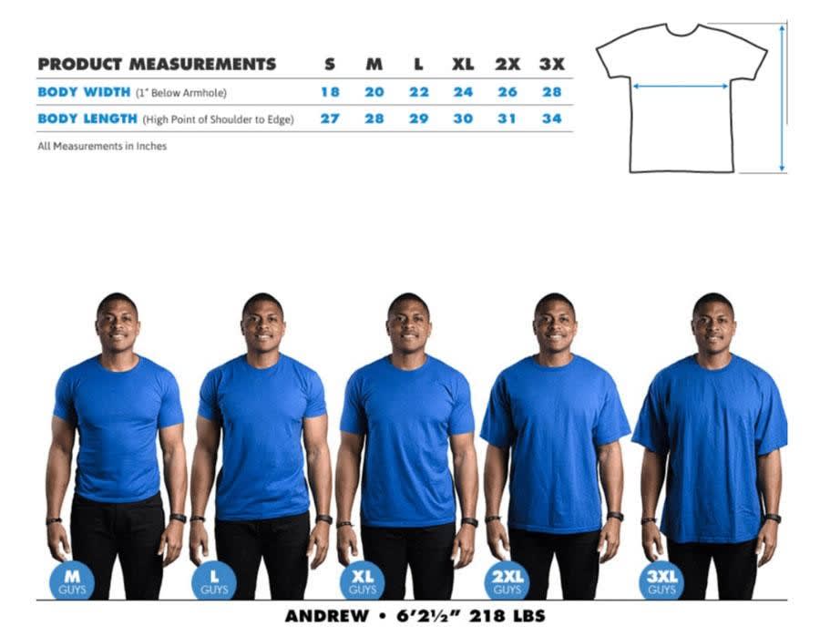
Images & Video Can Answer Questions
The way you show a product can help answer questions. A picture is worth a thousand words because seeing something can answer so many questions.
Keep that in mind when you prepare your images. Design your photo shoot with that in mind:
- Detailed, high-resolution product photos will allow shoppers to see details and answer their own questions.
- Photos of the product in context—as opposed to an isolated product in a studio—can answer questions about relative size, use, and more.
- Photos might also communicate a feeling or an energy about your product—and might not even feature your product in the photo. This might answer questions a shopper didn’t even realize they had.
Video can also be used to do all of these things. A quality video of your product can answer so many questions about how it works. You can also explore more complex questions—an installation video would answer whether or not a shopper could handle the project.
Reviews
Customer reviews can be another way to answer questions.
The more context you give to a review the more helpful it can be. Knowing a sports product was reviewed by an athletic female in their 20s will tell you something very different than if it was reviewed by a sedentary male in their 50s. That kind of context can help answer questions—maybe the athlete was critical, but the shopper relates to the inactive person and his positive review is what cleared their roadblocks.
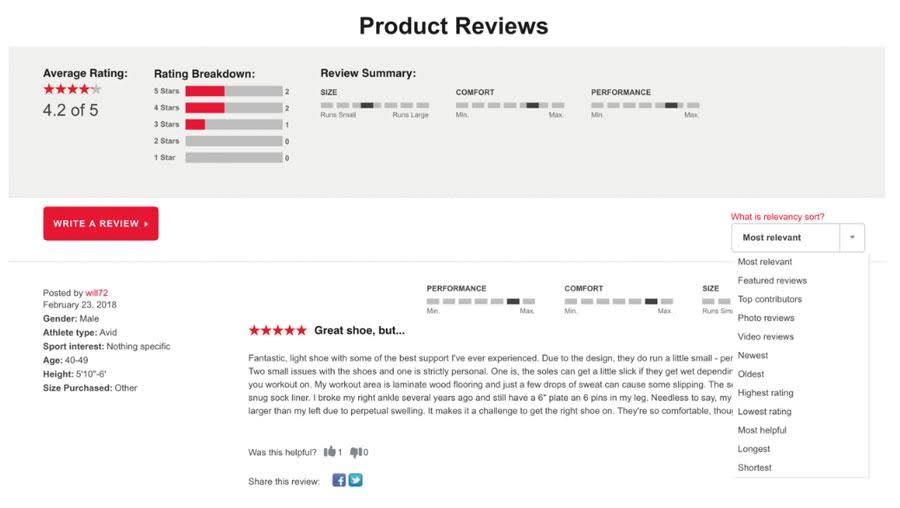
Sometimes even negative reviews can answer questions because they offer a snapshot of a product’s biggest problems. And customers are savvy enough to sort through that feedback: “The only one-star review is a guy complaining because the toaster doesn’t have Bluetooth? Well, I don’t need that, so if that’s the only issue I’m ready to buy.”
Community Help
You can also put your customers to work answering questions. Instead of doing all the work yourself, just let shoppers ask questions and allow your customers to answer them. You’ll need to moderate this content, but it can be an easy way to generate questions you might not have considered—and get them answered at the same time.
These kinds of features that answer questions can be a powerful way to design your eCommerce site for conversions.
3. Match Discounts to the Right Audience
Discounts and offers can be an effective way to convert shoppers. But it really depends on your audience. You need to match the right offer to the right shopper.
- A bargain shopper is most likely to respond to a clearance sale.
- A loyal shopper is going to be more interested in new products.
- A hesitant shopper may need a discount or free shipping to make that first purchase.
If you’re going to design your eCommerce site for conversions, that means paying attention to the right audience.
Test what you’re doing and make sure you’re hitting the right audiences.
4. Help Shoppers Find What They Want
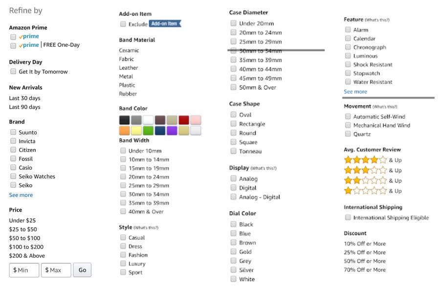
If people can’t find what they want, you’re not going to make any sales. If you’re going to design your eCommerce site for conversions, you need to design the actual hierarchy and structure to make it easier for people to find the content they want.
Product categories, hierarchies, breadcrumbs, and even a robust search are all ways to help shoppers find what they’re looking for.
Amazon has a standard way of selling products, whether it’s a $1 screw or a $600 watch. That approach misses out on some real opportunities (see below), but it also means they’re very consistent with all their ‘find something’ tools. The standard search is simple, but you can filter for all kinds of variables to find what you’re looking for. They’re also great at product categories and showing breadcrumbs to help customers find what they want.
5. Tell a Story
Aside from speed, one of the best ways to design your eCommerce site for conversions is to tell a story.
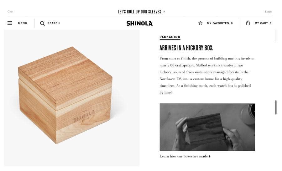
Amazon may make that $600 watch easy to find, but they’re not very good at telling a story about it. Shinola does an incredible job telling a story about their $600 watch. And really, if you’re the kind of person who will buy a $600 watch, you want to be told a story about why that watch is so amazing (again, know your audience).
Shinola went into extreme detail about their watch, covering the mechanism, the dial, the case, the strap—even the box it comes in.
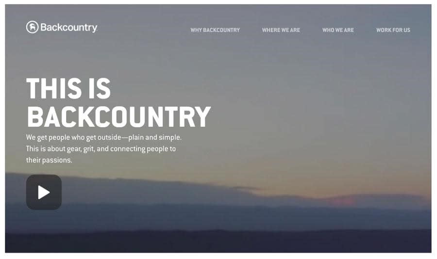
It might be content that tells a story, but it can also be images or video. Backcountry does a great job talking about why they exist. It’s not a product pitch, but it’s a story that makes you love their company and want to buy from them.
Design Your eCommerce Site for Conversions: It’s Hard
Remember that eCommerce is hard. You don’t always have the time or money to pour into every one of these solutions. You’ll need to prioritize, test, and tweak.
There are so many suggestions to design your eCommerce site for conversions, but that doesn’t mean you can get to all of them. But if you focus on these five areas and start implementing solutions, you’ll end up with a very effective store that drives conversions.
Want to Learn More about Designing your eCommerce site for Conversions?
Check out the full webinar from Chris Lema at our Liquid Web Hub.
[ad_2]
Source link


